Websites that look and perform perfectly on every device
Mobile-First Responsive Design
At SortedWebs, we create websites that adapt seamlessly to all screen sizes and devices. Our responsive design approach ensures your site provides an optimal viewing experience—from desktop monitors to smartphones—maximizing user engagement and conversions.

Touch-Optimized Elements
We design with touch interactions in mind, creating easy-to-use interfaces for mobile and tablet users.
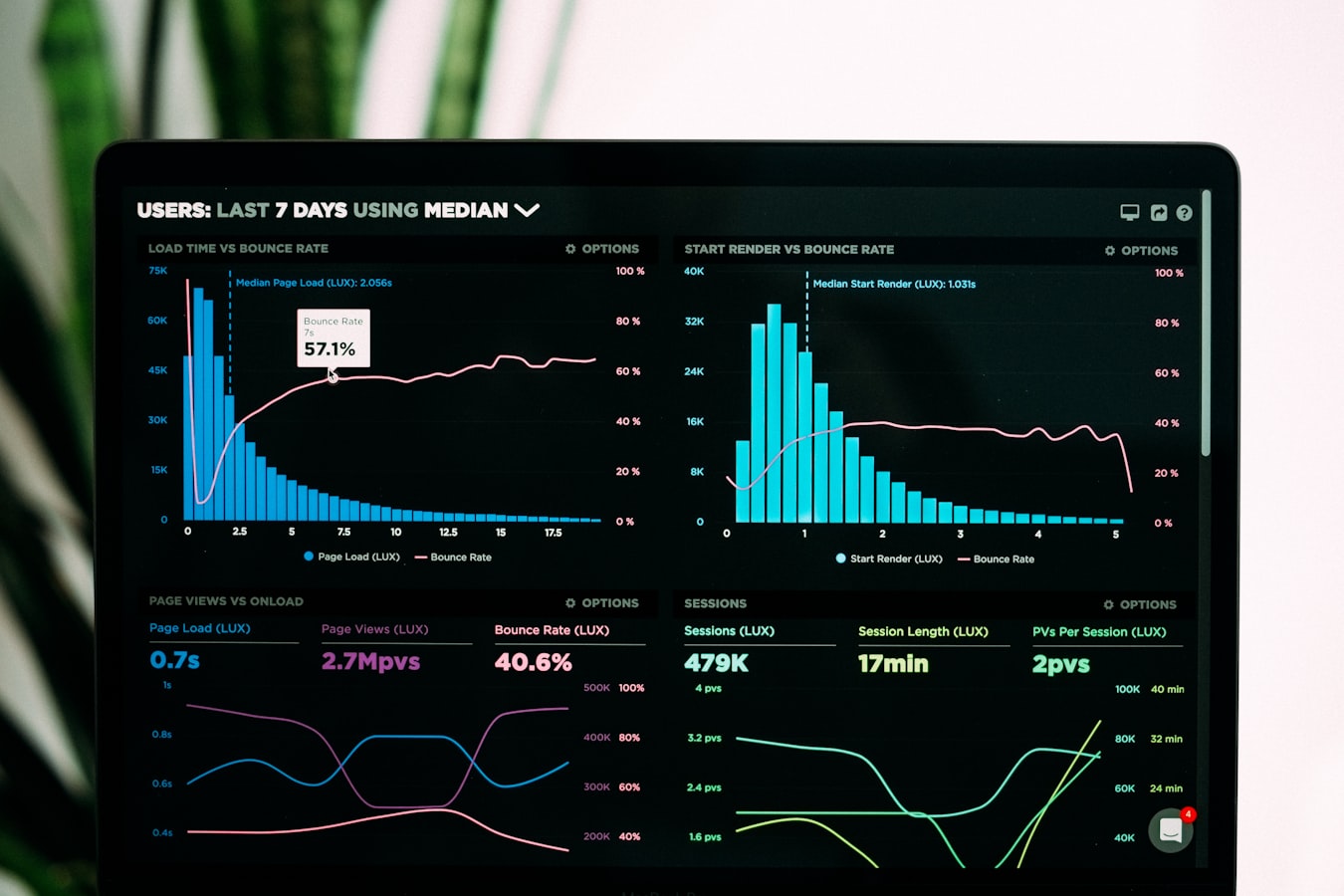
Performance Optimization
Our responsive sites are built for speed across all devices, with special attention to mobile performance.
Fluid Grid Layouts
We create flexible layouts that adapt proportionally to any screen size, ensuring your content looks great everywhere.
Responsive Images & Media
Our designs include optimized images and media that load appropriately for each device, improving performance.
Optimized for Every Screen
Our responsive designs ensure your website looks and functions perfectly across all devices and screen sizes.
Smartphones
Optimized for various screen sizes from small iPhones to large Android devices with touch-friendly navigation.
Tablets
Designed for both portrait and landscape orientations with optimized touch targets and navigation.
Laptops & Desktops
Full-featured experiences that take advantage of larger screens with enhanced layouts and interactions.
Smart TVs & Large Displays
Optimized for viewing from a distance with simplified navigation and larger text for readability.
Elements of Responsive Design
Our responsive websites incorporate these essential features to ensure a seamless experience across all devices.
Fluid Grid Layouts
Our designs use proportional grids that adapt to any screen size, maintaining visual harmony across devices.

Flexible Images
Images automatically resize within their containing elements, ensuring they never break your layout.

Media Queries
We use CSS media queries to apply different styles for different devices and viewing conditions.

Touch-Friendly Design
Larger touch targets and swipe-friendly interfaces make navigation intuitive on touch devices.

Progressive Enhancement
We build with a core experience that works everywhere, then enhance for devices with more capabilities.

Performance Optimization
Fast-loading pages with optimized assets ensure a smooth experience even on slower connections.
Why Your Business Needs Responsive Design
Responsive design isn't just about looking good—it delivers real business benefits that impact your bottom line.
Increased Mobile Traffic
With over 60% of web traffic coming from mobile devices, responsive design ensures you capture this audience.
Improved User Experience
A consistent experience across devices leads to higher engagement, longer visits, and better conversions.
Better SEO Performance
Google prioritizes mobile-friendly websites in search results, improving your visibility and rankings.
Cost Efficiency
Maintain one website instead of separate mobile and desktop versions, reducing development and maintenance costs.
How We Create Responsive Websites
Our proven process ensures your website delivers an exceptional experience on every device.
Mobile-First Planning
We start by designing for mobile devices first, then progressively enhance for larger screens.
Flexible Grid Design
We create fluid layouts using modern CSS grid and flexbox techniques that adapt to any screen.
Responsive Asset Creation
Images and media are optimized for different screen sizes and connection speeds.
Cross-Device Testing
We rigorously test on real devices to ensure perfect functionality across the device spectrum.

Ready for a Website That Works Everywhere?
Let's create a responsive website that delivers an exceptional experience on every device.